


BLOG
Jun 12, 2018
The importance of storefront branding
The power of successful storefronts
There is no doubt first impressions count when creating customer relationships, and for retail businesses your storefront often represents that critical first point of contact. Everyday, countless people walk our streets and malls, passing hundreds of stores. And every storefront is competing for the attention of those potential customers—the goal of your storefront design is at best to beckon buyers inside, or at least to create a memorable impression that triggers a future visit. A striking storefront sign can make the difference between a successful and unsuccessful business. |
Compelling storefronts convert buyers
A recent FedEx Office Survey on storefront signage, its power of attraction, its impact on customers’ intent to visit your store to make a purchase concluded that stand-out storefront signage contributes to sales. According to the survey, 76% of American consumers make their first-time visit based on store signage, and 68% have purchased a product or service because of an eye-catching storefront sign.
Once inside your store, visitors are much more likely to make a purchase
There is tremendous significance in the value of attracting potential buyers over the threshold of your store. Once inside your store, the chances of your prospect buying are increased exponentially—and there is the opportunity for your prospect visitor to buy multiple products and/or services while in your store.
What is an effective storefront sign?
So if capturing prospects’ attention with storefront signage is so important, what does it take to create highly effective, memorable signage? After all, a poorly executed storefront signage campaign is a lost opportunity. According to a study performed by Microsoft Corporation, the average attention span of a passing prospect is as low as eight seconds. Here are some tips on how to maximize the effectiveness of your storefront signs to get prospects into your store.
Attract attention
There are a few ways to capture prospect attention:
- Motion: Perhaps due to survival instincts, humans are drawn to moving objects. This is why digital signage is more common nowadays. Animated signage will naturally attract more attention than a static sign.
- Colors: It is scientifically proven that specific colors draw more attention than other colors. This is why traffic signs, such as traffic lights and stop signs, use red. The color red is proven to capture the most attention—but be careful not to overdo it! Here’s a quick color reference chart.
|
Red signifies power. It gets and holds attention, which is why it’s the most popular marketing color. |
Blue signifies business professional and trust. Mix blue with complimentary colors to differentiate your brand. |
|
Although primarily attractive to a young female demographic, pink can be fun, frilly, and feminine. |
Yellow signifies power and confidence, but can be a challenging hue to work with. A great color for getting attention. |
|
Green is warm and inviting. It also denotes health, environment, and goodwill. Lastly, green is the color of money, and generates thoughts of wealth. |
Purple is the color of royalty, making it perfect for lending a touch of elegance and prestige. |
|
Like purple, gold is elegant and prestigious, but adds an element of power. Often combined with green or purple, gold is a powerful color that symbolizes wealth and pedigree. |
Orange signifies energy. Its powerful attention-getting properties are both fun and exciting and fresh. |
|
Brown is known as a comfort color that is known to relax customers. |
Black is highly versatile and the most commonly used color. Modern or traditional, exciting or relaxing, it adds drama and distinction. |
 RED
RED BLUE
BLUE PINK
PINK YELLOW
 GREEN
GREEN PURPLE
 GOLD
GOLD ORANGE
 BROWN
BROWN BLACK
BLACK
- Human faces: Human faces are powerful attention attractors. All living creatures seek familiarity, because familiarity generates positive feelings. In other words, due to natural instincts, humans naturally appreciate the presence of other human beings. Numerous eye-tracking studies have proved that, when looking at a picture, human eyes tend to dwell on human faces. The presence of human faces both encourages engagement and delivers relevance.
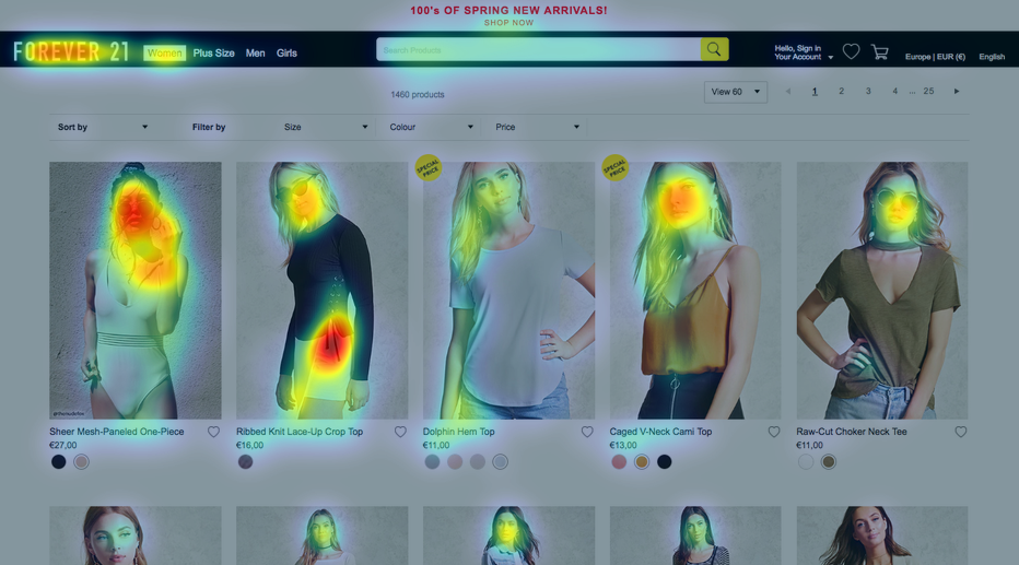
Eyequant analysis shows that human eyes tend to dwell on human faces and dark text—viewer focus points indicated by red/yellow indicators.
- Headlines: It’s okay if your signage campaign lacks motion or pictures; your campaign can also attract attention with just colors and text. Viewers tend to read text when their curiosity is provoked with surprises, questions, or mysteries. A simple question, or an unusual twist in your headline will get your prospects reading.
Make an impact
So once you’ve got your prospect’s attention, you’ve got eight seconds to make an impression. Storefront signs need to present a strong brand that delivers relevance and motivates buying.
- Strong brands: When your signage content, colors, shape, tone, and mood matches what your audience is looking for, your brand becomes strong. For example, a campaign for a luxurious spa might contain gold and black colors and use cursive text to indicate luxury and elegance. Creating strong branding materials certainly requires an expert who understand your brand and target audience very well.
- Relevance and engagement: Your product and/or services must either solve a problem for your target customer, or fulfill their needs. Your campaign will fail to attract your audience to purchase if the campaign does not relate to your customer’s needs. It is important for your storefront sign to connect with your target audience to communicate how your product is important and valuable to them!